When Your Banner Says One Thing and Your Business Card Says Another
You have probably seen it without thinking much about it. A company sets up at a trade show with a sharp-looking banner — clean colors, modern logo, professional font. Then they hand you a business card with a slightly different shade of blue, a logo that looks like it was made five years ago, and a font that does not match anything on the banner. Or you visit their storefront and the window graphics use a completely different color palette than the brochure you picked up last week.
None of these things are catastrophic on their own. But together, they create a subtle impression that the business is not quite put together. And in a market like Atlanta where competition for attention is fierce — whether you are on Peachtree Road in Buckhead or at a vendor fair in Piedmont Park — those small inconsistencies add up to missed trust.
What Consistency Actually Means in Print
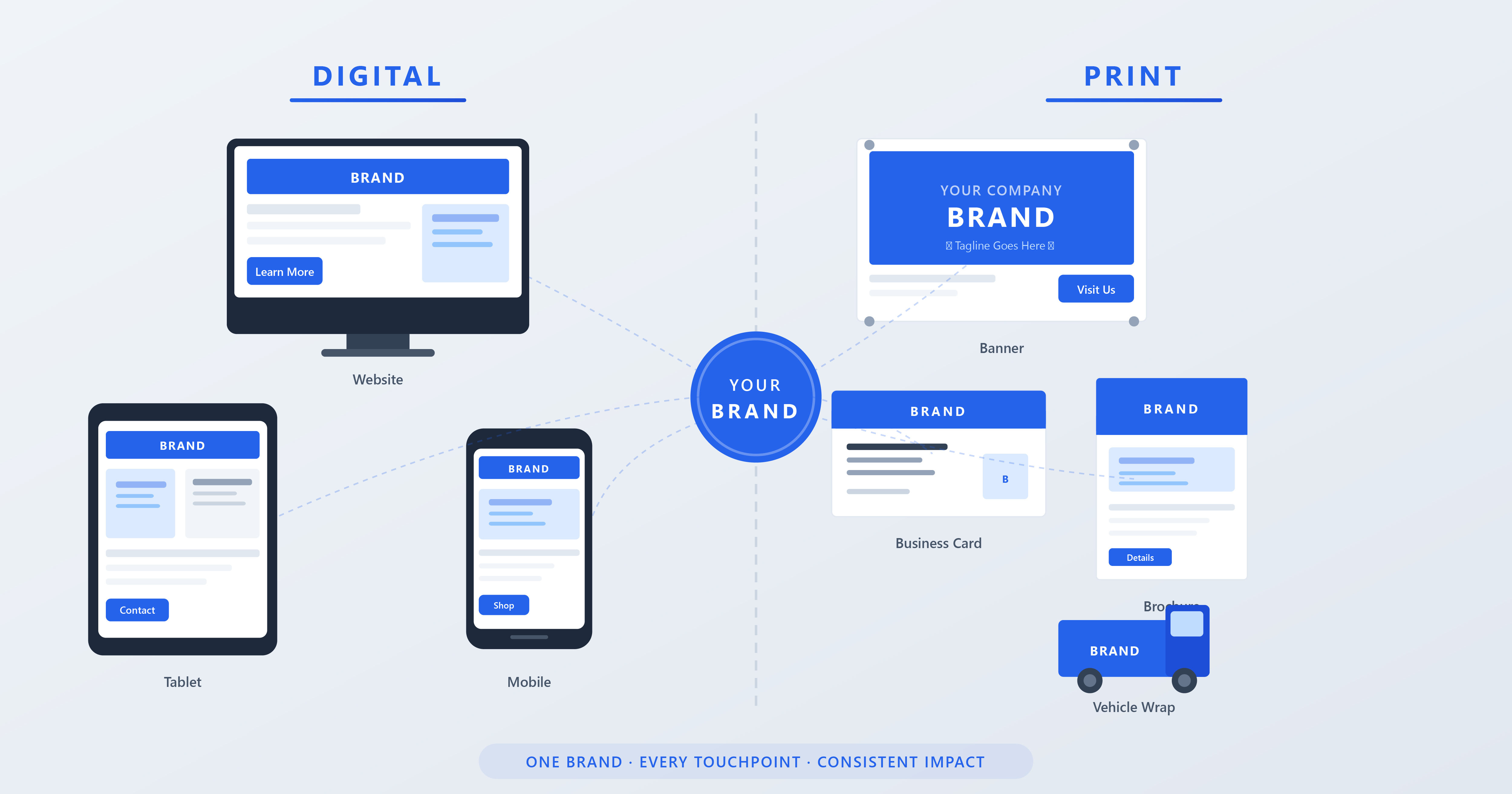
Brand consistency in printed materials is not just about using the same logo everywhere. It is about making sure that every physical piece a customer sees feels like it came from the same company. That means consistent colors, consistent typography, consistent imagery style, and consistent tone. When all of those elements align, your materials reinforce each other every time someone encounters your brand.
Think about the touchpoints a single customer might experience: they drive past your vehicle wrap on I-285, then see your banner at a local event, then pick up your brochure, then visit your office and see your lobby signage. If all four of those touchpoints use the same visual language, the cumulative effect is powerful. The customer feels like they are dealing with an established, professional operation — even if you are a small business with a tight budget.
The Color Problem Is Real
Color consistency across different print materials is one of the trickiest things to get right, and it is where most businesses trip up. The blue on your business card might look perfect, but when that same blue gets printed on a vinyl banner, it can shift noticeably. Print it on a vehicle wrap and it might shift again. Put it on a backlit sign and the color looks completely different because light is passing through it instead of reflecting off it.
This happens because different materials absorb and reflect ink differently, and different printing technologies lay down color in different ways. A digital press printing business cards uses a different process than a wide-format printer producing a banner, which is different again from a latex printer outputting vehicle wrap film.
The solution is to work from defined color standards. If your brand uses specific Pantone (PMS) colors, those references give your printer a target to match regardless of the material or technology. We can adjust ink formulations and printer profiles to get as close as physically possible to your specified color on any substrate. Without that reference point, every print job becomes a guess — and guesses lead to drift over time.
Templates Save Time and Prevent Drift
One of the most practical things a business can do to maintain consistency is to create templates for the materials they use regularly. If you reorder business cards, brochures, event banners, or promotional flyers on a recurring basis, having a locked-down template for each one means the design stays consistent every time — even if a different person on your team is placing the order.
Good templates specify exact colors (with PMS or CMYK values), exact fonts, logo placement rules, and margin specifications. They take the guesswork out of reorders and prevent the slow drift that happens when someone recreates a design from memory or from a low-resolution screenshot of the last version.
For businesses in Atlanta that work with us regularly, we keep templates on file so that reorders are fast and consistent. You call, reference the job, and we reproduce it exactly — same colors, same layout, same quality. No re-explaining, no re-proofing unless you want to make intentional changes.
Your Logo Is Not Your Brand — But It Needs to Be Used Correctly
Your logo is the single most recognizable element of your brand, and how it appears on printed materials matters more than most people realize. A logo that gets stretched, compressed, placed on a clashing background, or printed at too low a resolution undermines the professionalism of everything around it.
The most common logo problems we see on print files are low resolution (the logo looks fuzzy or pixelated when printed large), incorrect aspect ratio (someone stretched it to fit a space), and wrong file format (a JPEG with a white box around it instead of a transparent PNG or vector file). All of these are preventable if you have clean, high-resolution logo files in the right formats and share them with anyone who produces materials for your business.
At minimum, you should have your logo in vector format (AI, EPS, or SVG) for large-format printing and signage, and in high-resolution PNG with transparent background for smaller applications. If your designer originally created your logo, they should be able to provide these files. If you cannot track them down, it is worth having them recreated properly — it is a one-time investment that pays off every time you print.
The Checklist for Keeping Everything on Brand
If you are looking to tighten up your brand consistency across print materials, here is a practical starting point. Define your brand colors with specific PMS or CMYK values and share them with every vendor who prints for you. Create a simple brand guide — even a one-page document — that shows your logo, colors, fonts, and basic usage rules. Keep your logo files organized in vector and high-res raster formats. Build templates for your most frequently ordered materials. And work with a printer who keeps your specs on file so reorders stay consistent without extra effort on your part.
Consistency is not about being rigid or boring. It is about making sure every piece of printed material your business puts into the world reinforces the same identity. In a city like Atlanta where businesses are constantly competing for attention, that kind of cohesion is a real competitive advantage — and it costs nothing extra once the foundation is in place.
Ready to Get Started?
Contact Extreme Color today for vehicle wraps, signs, banners, and more.
Get a Free Quote