 You spent real time and money building your brand identity —the right colors, the right feel, the right message. But if those colors shift every time you print a banner, order a sign, or produce new marketing materials, your brand suffers. That's where the Pantone Matching System (PMS) comes in.
What Is the Pantone Matching System?
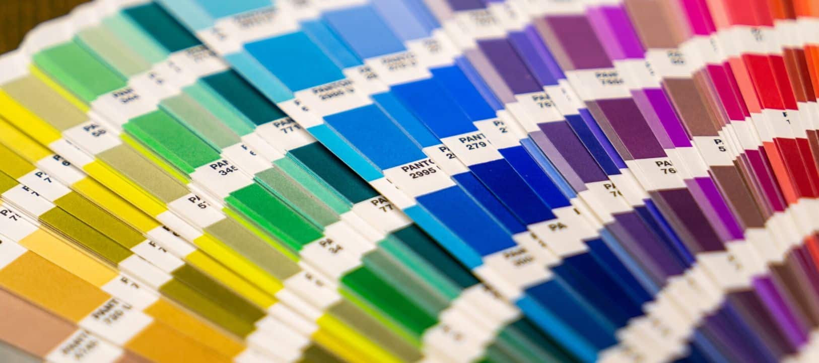
Pantone is a standardized color language used across virtually every industry that deals in print, materials, and manufacturing. Each PMS color is assigned a specific number —like PMS 286 C (a rich royal blue) or PMS 485 C (a bold red) —along with precise ink formulas that produce the exact same result no matter where or how it is printed. Unlike standard RGB colors (designed for screens) or CMYK values (which vary by printer, paper, and environment), a PMS color is a known quantity. When you specify PMS 286 C, any qualified printer in the world —including our team here at Extreme Color —knows exactly what that color should look like.The Real Cost of Color Inconsistency
Color drift is more common than most businesses realize —and more damaging. Consider these scenarios:
- Your new outdoor banner looks noticeably different in color from the banner you ordered last year.
- Your lobby signage doesn't match your business cards or your vehicle wrap.
- A franchise location's signage looks subtly "off" compared to the corporate standard.
These inconsistencies erode trust. Customers may not consciously notice that your blue is slightly different between two signs, but the overall impression —that something feels "off" about your brand —registers. Over time, inconsistent brand presentation undermines the professionalism you've worked hard to establish.
How PMS Colors Protect Your Brand in Large Format Printing
In large format printing and signage, maintaining color fidelity is especially challenging. Substrates vary —vinyl, fabric, rigid board, foam core, corrugated plastic —and each material absorbs ink differently. Environmental factors like UV exposure affect how colors appear over time. A color specification that looks great on a computer screen can print significantly differently in the real world.
PMS colors solve this by providing:
- A precise color target that our RIP software and calibrated printers can match consistently across print runs and media types.
- A shared language between your brand team, your designer, and your print vendor —eliminating guesswork and back-and-forth.
- A documented standard your team can reference for every future project, whether it's a trade show display, a fleet of vehicle wraps, or a retail storefront.
PMS in Practice: What to Give Your Sign Vendor
If you want truly consistent results, here's what we recommend providing to your print and signage vendor:
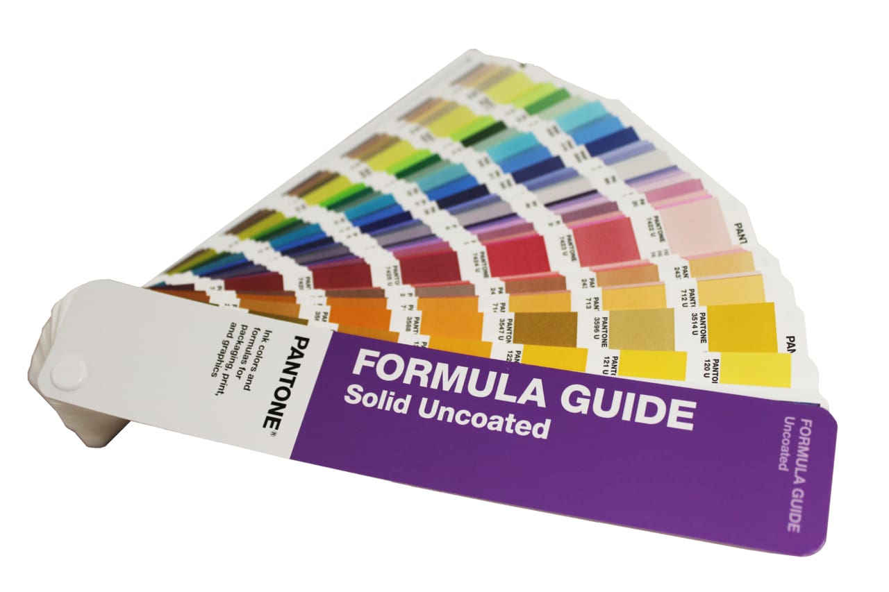
- PMS color numbers for each brand color (coated "C" variants for most print applications, uncoated "U" for specialty stocks).
- A brand standards guide that documents which PMS color is used for each element (logo, background, text, accents).
- Print-ready files with PMS swatches already applied in the design software (Adobe Illustrator is the industry standard).
The more clearly your color standards are documented, the better any reputable print shop —including ours —can meet them.
Don't Have PMS Colors Yet? We Can Help.
If your brand was built around a logo file without documented PMS values, you're not alone. Many small and mid-size businesses have never had a formal color standard. Our team at Extreme Color can help you identify the closest PMS equivalents for your existing brand colors and build a simple one-page color reference you can use for all future print projects.
Getting this right once saves you headaches —and money —for every project that follows.
Ready to lock in your brand colors? Contact Extreme Color at our Marietta, GA production facility. We print locally, so you can see exactly what you're getting.
Ready to Get Started?
Contact Extreme Color today for vehicle wraps, signs, banners, and more.
Get a Free Quote