The Most Underrated Sign in Retail
Walk down Ponce City Market on a weekend, or any commercial stretch in Inman Park, and you'll see them everywhere — A-frame signs propped at the edge of sidewalks, advertising specials, pointing customers around corners, or just announcing that a shop is open. They're some of the cheapest signage a business can buy, and for that reason, most of them are terrible.
We see them every day at the shop. Faded chalk smudges from a hot Atlanta rain. Generic stock graphics ordered online. Layouts so cluttered the message can't be read from five feet away, let alone the twenty feet that matters. An A-frame sign is the closest thing in physical retail to a paid ad — a small, purchased moment of attention competing against every other distraction on the street. Done right, it converts foot traffic. Done lazily, it's furniture.
What an A-Frame Actually Has to Do
The job of a sidewalk sign is narrow: stop someone walking by, deliver one or two pieces of information, and make them act. That's it. Most failed A-frames fail because they try to do more — listing five menu items, three hours of operation, two QR codes, the social handles, and the website. Pedestrians don't read sidewalk signs. They glance.
The discipline of A-frame design is choosing one message and making it impossible to miss. "Now serving brunch — Saturday and Sunday." "10% off any frame today only." "Open — come in." A single, scannable hook. The rest of the information lives inside the store, on a menu, or on the website. The sign's job is to win the next two steps.
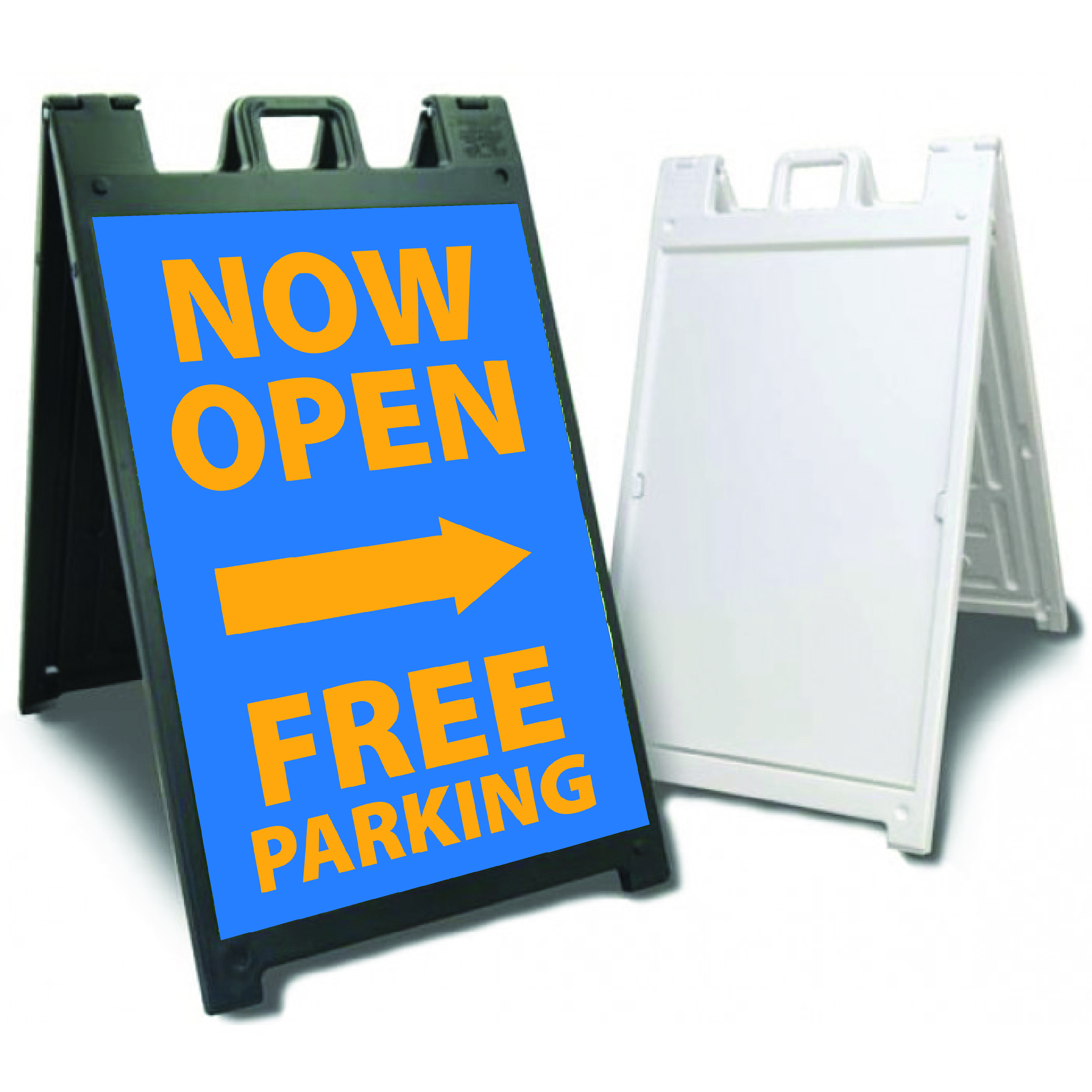
Chalkboard Versus Printed Vinyl
Two main formats dominate the category, and they serve different jobs. Chalkboard A-frames are flexible — they let staff update the message every day, which works for restaurants running daily specials or shops with rotating promotions. They lose, however, every time it rains. They also depend entirely on whoever has the chalk. We've seen genuinely talented chalk artists turn an A-frame into a piece of street art, and we've seen "open" written in handwriting that looks like a ransom note.
Printed vinyl panels — magnetic or slide-in inserts — solve the consistency problem. The art is designed once, printed at high resolution, and the same message reads cleanly every day for the life of the panel. For businesses that don't change their offer often, this is almost always the better answer. We typically build A-frames around interchangeable panels so a coffee shop, for example, can swap from "iced lattes — summer menu" to "hot cider — winter menu" in five seconds without redesigning the whole sign.
What Atlanta's Weather Does to Sidewalk Signs
The standard issue with sidewalk signs in Atlanta is that they live outside in conditions most graphics weren't designed for. Pollen season coats everything yellow. Summer humidity warps cheap materials. Afternoon storms that show up from nowhere can drench an unprotected sign in twenty minutes. We've replaced more sun-bleached, water-warped A-frames than we can count for clients on Marietta Street and along the Beltline.
The fix is matching the material to the punishment. Aluminum or heavy-duty plastic frames hold up. UV-stable printed vinyl resists fading. Lamination on the print surface protects against rain and the daily wipe-downs that staff inevitably do with whatever's handy. Cutting corners on materials looks like savings on the first invoice and an annual replacement cost on every one after.
Where the Sign Sits Matters More Than the Sign
An A-frame on a busy sidewalk is competing against parked cars, food smells, conversation, and phone screens. Placement is half the battle. We tell clients to walk the sidewalk approaching their own storefront from both directions, at the speed a normal pedestrian moves, and figure out where the sign needs to sit to be visible from twenty feet out. Right at the edge of the sidewalk, angled toward the heavier flow of traffic, usually beats the spot that "looks nice" right next to the door.
Atlanta has codes about right-of-way placement, and they vary by neighborhood and city. Some commercial districts have strict rules about where A-frames can sit relative to the curb. Worth a five-minute conversation with the city before investing in signage, especially in business improvement districts where enforcement is real.
Designing for the Glance, Not the Read
A pedestrian walking past a storefront gives a sidewalk sign about two seconds of attention, max. The design has to communicate in that window. That means high-contrast color combinations, type that's bigger than feels natural on a screen, and one focal element that does the heavy lifting. Most of the A-frames we see fail in this category because they were designed on a 27-inch monitor at arm's length and never sanity-checked at the distance and pace they'll actually be read at.
The Math of a Good Sidewalk Sign
A well-built A-frame with a properly designed graphic costs less than a single boosted social media post in most months. It works seven days a week without anyone refilling its budget. It sits in front of the only audience that has already made the effort to walk past your front door — pedestrians who are physically present, capable of acting, and one decision away from coming inside.
This is the unique leverage of sidewalk signage. It's one of the cheapest customer acquisition tools in retail and the one most likely to be designed by whoever happened to have time on a Tuesday. We build A-frames for restaurants, salons, boutiques, and service businesses across Atlanta because we've watched what happens when the sign in front of a business actually treats foot traffic like a real marketing channel.
What to Bring Us to Start
If you're thinking about updating or replacing an A-frame, the most useful thing to bring our team is a clear answer to one question: what does the sign need to do for you? "Get more customers" isn't specific enough. "Get the lunch crowd to know we have a back patio" is specific enough to design around. From there, we can talk about format, materials, panel systems, and how the artwork should be built to do the actual job.
Ready to Get Started?
Contact Extreme Color today for vehicle wraps, signs, banners, and more.
Get a Free Quote